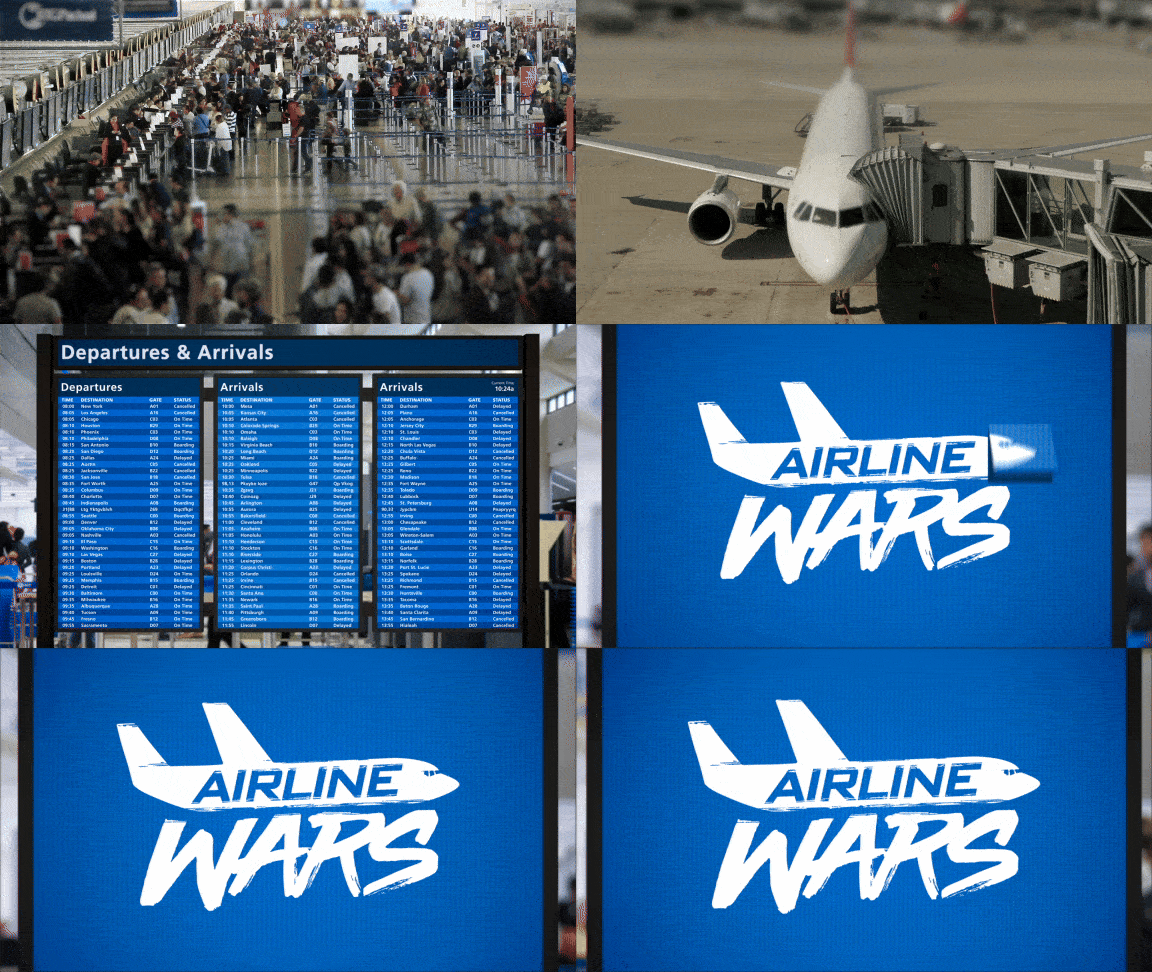
Designed and animated a new show package for A&E’s Airline Wars. Built mostly on clips recorded by air travelers, Airline Wars relied heavily on a unifying thread to tie the program all together, giving it a cohesive look from start to finish.
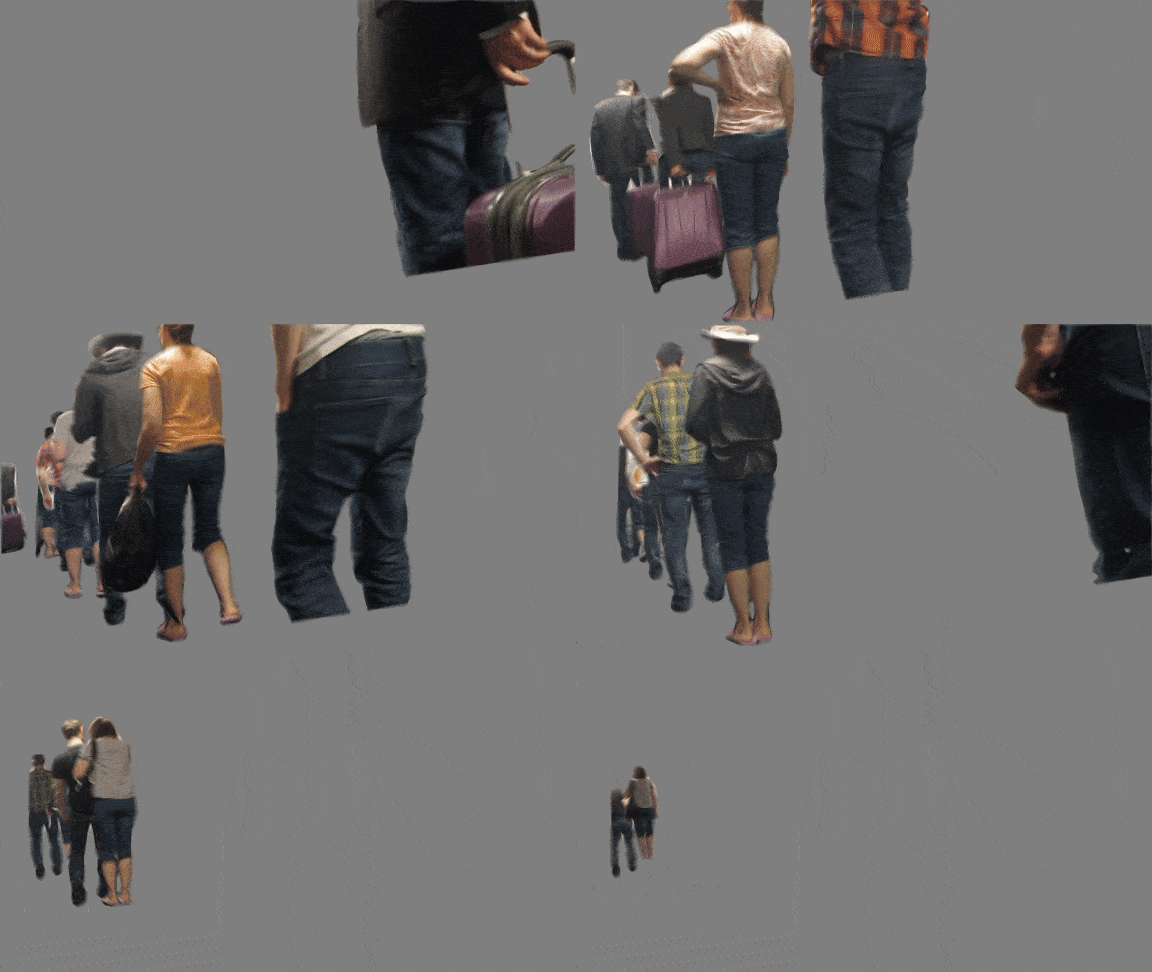
Some of the graphics called for shots of passengers disembarking from a plane, passing down the aisle to the left and right of the camera. Stock footage wasn’t turning up anything usable so my wife and I acted out parts, switching costumes to create different passenger characters.
The passengers were going to be a textural background element with stop motion-y and depth of field effects, so I knew I could get away with loosey goosey roto’d for each.
INITIAL CONCEPTS
‘OBJECTS’
Mood Board
‘Objects’ used three-dimensional objects found in the airport and the sky as devices for presenting show messaging. Elements could have been as colorful as the characters featured on the show, with a bright palette of primary colors to catch the viewer’s eye. Baggage claim carousels would have delivered lower third information, drink carts would transition clips from one shot to the next while sliding past down the aisle, and title cards could spin on with wheely carry-ons.
Additional items would even include plane bodies, in-flight beverage cans, window shades, sleep masks, pillows, you name it - the list goes on.
Endpage, title card and transition sketches
‘PAPER’
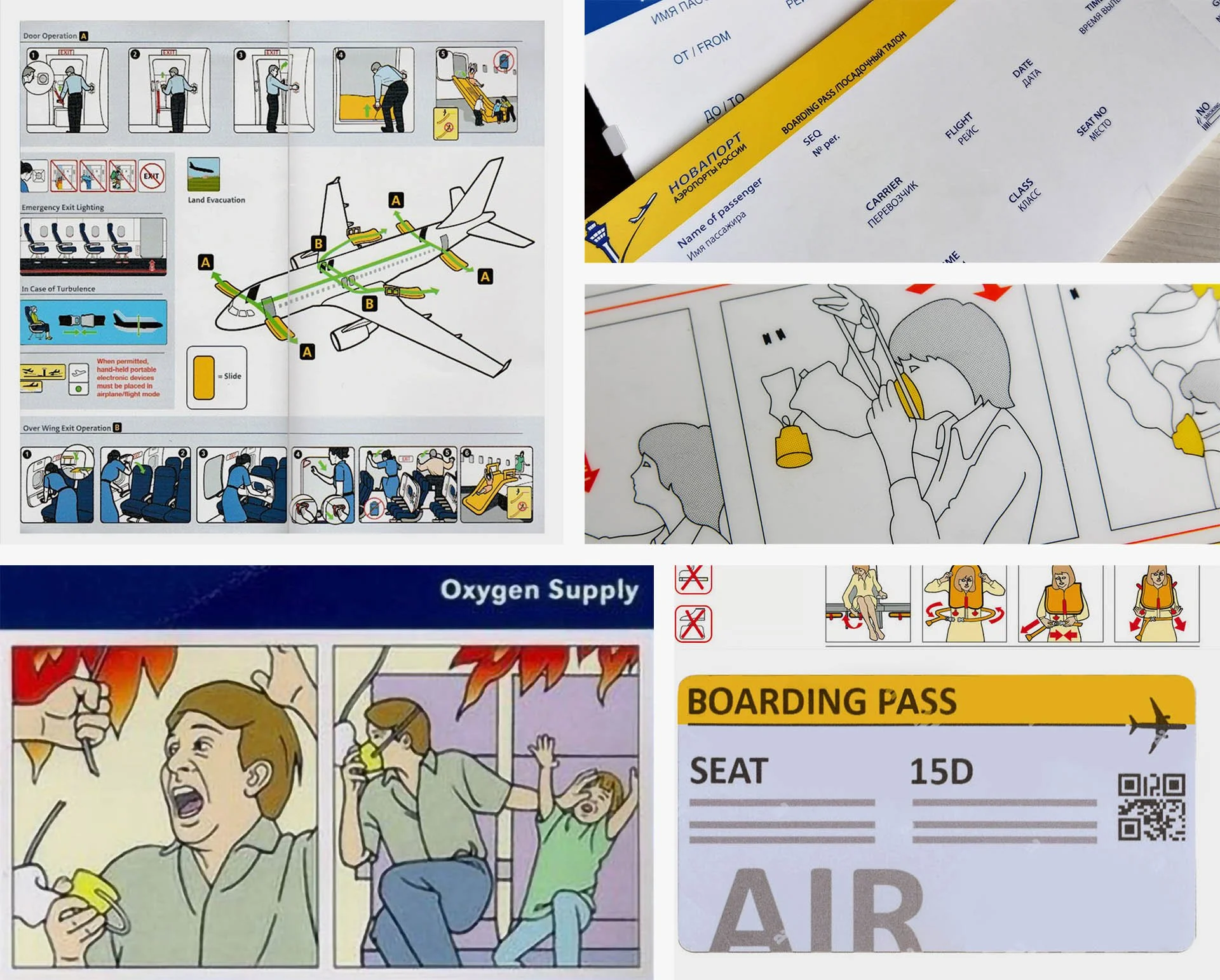
Mood Board
This concept used anything made of paper and encountered when traveling by air. Safety cards? Check. Baggage claim tags. Boarding passes. Napkins. Air sickness bags. Check, check, check. A cohesive color palette would have tied each graphic together, with simplified design elements improving readability.
Think “boarding pass lower thirds” spit out from the side of the screen. Transitions made from safety cards that unfold across footage, featuring frozen-moment line drawings of conflicts from the show. Title cards can be found on baggage claim stickers, and the endpage would have guided viewers to the show logo. Be sure to put your own mask on first.
Endpage, title card and transition sketches
‘WAYFINDING’
Mood Board
‘Wayfinding’ used the ubiquitous blue of airline logos and the sky overhead to create in-situ sign elements. Featured some classic Frutiger typography and symbol iconography to deliver the show’s graphics.
Endpage, title card and transition sketches
‘DIGITAL’
Mood Board
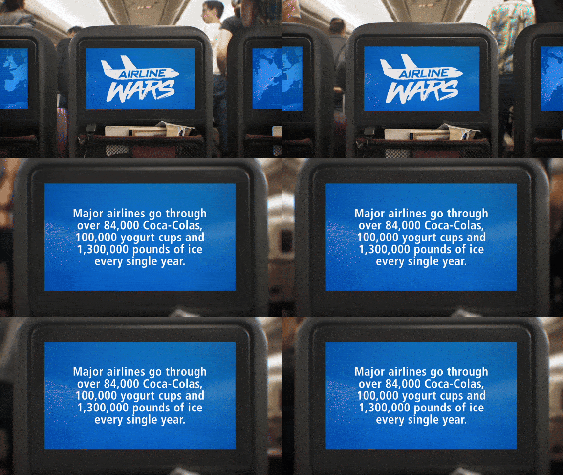
‘Digital’ took all the electronic screens in the airport and on the plane and used them to feature show branding instead of flight delays. Phones displaying lower thirds. Seat back screens and airline departure arrival panels with title cards, show logos, or even cascading transitions.
Endpage, title card and transition sketches


